October marked the eighteenth anniversary of the Troubled Asset Relief Program (TARP), when Congress authorized the Treasury Department to spend up to $700 billion to buy or insure “troubled assets.” At the time, the size of this rescue package was unbelievable. Since then, we have seen multiple larger stimulus packages: one in 2009 and several in 2020 and 2021. But while the Global Financial Crisis (GFC) was followed by a decade of inflation below the Fed’s target, the COVID-19 pandemic was followed by the highest inflation in four decades.
Why did we experience high inflation after the COVID-19 pandemic but not after the 2008 Global Financial Crisis, when both periods saw extraordinary Federal Reserve actions plus massive fiscal spending?
While many factors contributed, two stand out: the fiscal response to the pandemic was much larger and more widely distributed, and the underlying economic shocks were fundamentally different. The 2008 crisis followed sharp declines in aggregate demand. The pandemic, by contrast, produced a negative supply shock while aggregate demand, initially normal, was artificially boosted.
Government spending in 2008 supported financial institutions amid economic contraction, providing temporary liquidity, much of which was later repaid. In 2020 and 2021, on the other hand, trillions of dollars in federal spending ended up directly in the bank accounts of households and businesses. While those transfers increased nominal balances and successfully stimulated demand for goods, they did not create additional real output.
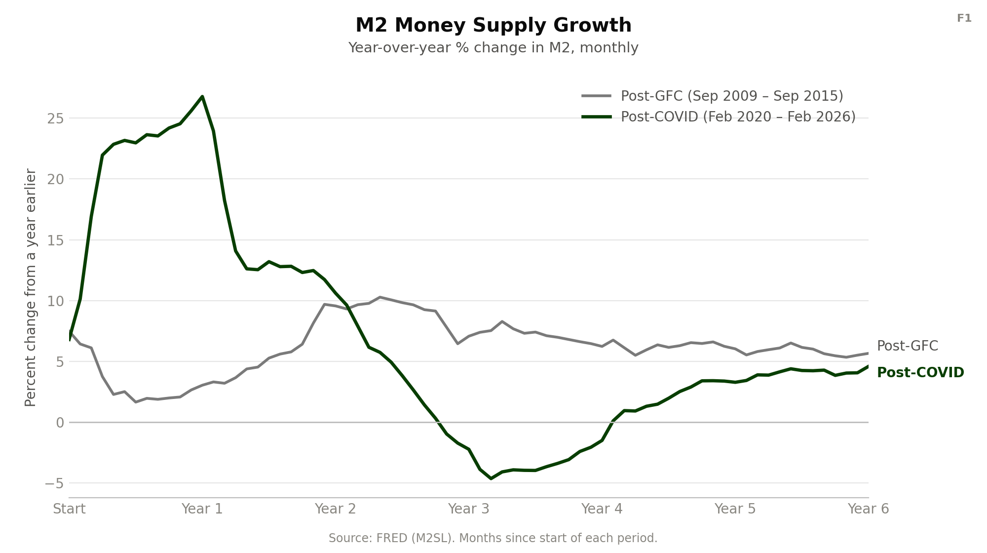
As a result, the money supply (M2) grew much more rapidly in the two years following the pandemic than the two years following the GFC. More money was circulating in an economy whose productive capacity had been constrained by lockdowns, so much of the increase in nominal balances was ultimately reflected in higher prices rather than greater real purchasing power.
The Fed’s Response Differed
During the 2008 financial crisis, the Federal Reserve cut its federal funds rate target from 5.25 percent in September 2007 to a range of 0–0.25 percent in December 2008. It was one of the most aggressive cuts in the Fed funds rate ever. The Fed also created a series of emergency lending facilities, including the Term Auction Facility (TAF), the Term Securities Lending Facility (TSLF), and the Term Asset-Backed Securities Loan Facility (TALF), as well as the Primary Dealer Credit Facility, the Commercial Paper Funding Facility, and the Money Market Investor Funding Facility.
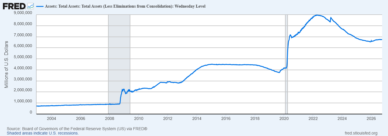
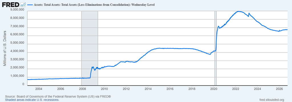
The commitment ceilings for these facilities were enormous. TAF could spend up to $900 billion, CPFF up to $1.7 trillion, and TALF up to $900 billion. While actual usage never hit these credit caps, the Fed had pulled out all the stops to rescue strapped financial markets: its balance sheet ballooned from roughly $800 billion in 2007 to about $2.2 trillion by the end of 2008. The balance sheet leveled off through the end of 2009, then continued growing through three rounds of quantitative easing (QE) to about $4.5 trillion by 2015. Although the Fed provided substantial liquidity in 2008, the economy was simultaneously contracting: lending, stock prices, employment, and output were falling.
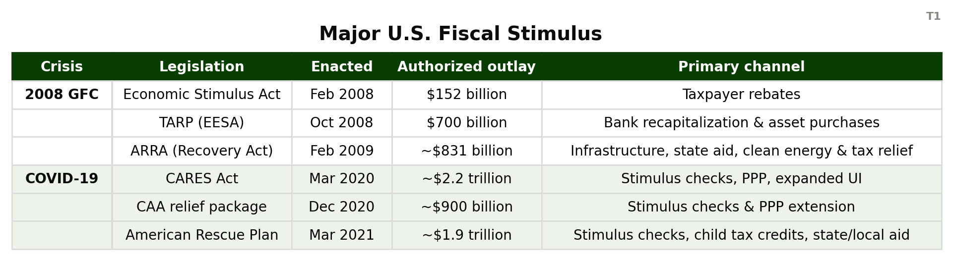
On the fiscal side, the federal government implemented several large stimulus programs. The Economic Stimulus Act in February 2008 was a $152 billion package, most of which went back to taxpayers as rebates. In 2009, Congress passed the American Recovery and Reinvestment Act (ARRA). Initially, ARRA authorized $787 billion in spending — that was later revised up to $831 billion.
In one sense, the Fed’s response to the pandemic seems more muted. It cut the target Fed funds rate from 1.50–1.75 percent in January 2020 to 0–0.25 percent by March 15, 2020 — two emergency cuts in as many months. While quick, this was a much smaller decline in the federal funds rate than during the 2008 financial crisis.
The Fed’s balance sheet, unfortunately, grew much more during the pandemic years than during the Global Financial Crisis. The Fed had about $4.2 trillion on the balance sheet in February 2020. A year later, that total had nearly doubled to $7.6 trillion. Then, it kept growing to a peak of about $8.9 trillion in April 2022.
The fiscal response to the pandemic was also far larger than the response to the GFC. Both the Trump and Biden administrations spent enormous sums. First, the CARES Act in March 2020 authorized about $2.2 trillion in spending. Another relief package in December authorized an additional $900 billion. Then, four months later, Congress passed the American Rescue Plan authorizing another $1.9 trillion in spending. That’s roughly $5 trillion in COVID-specific fiscal legislation alone — before counting subsequent infrastructure and industrial-policy spending.
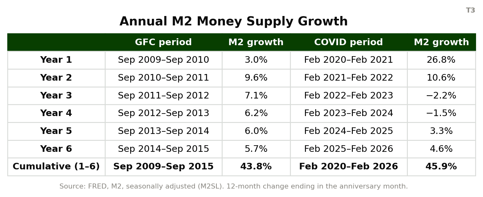
Initially, changes in the M2 money supply seem to explain the different inflation experiences following the 2008 financial crisis and the COVID-19 pandemic. M2 only grew about 13 percent over the two years following September 2009. But it grew nearly 40 percent in the two years following February 2020.
The relationship between M2 growth and inflation becomes less clear over the longer term. M2 continued growing steadily all six years following the GFC, while it contracted in 2022 and 2023 following the pandemic. As a result, cumulative M2 growth was nearly identical six years after each crisis: 43.8 percent after the GFC and 45.9 percent after the pandemic.
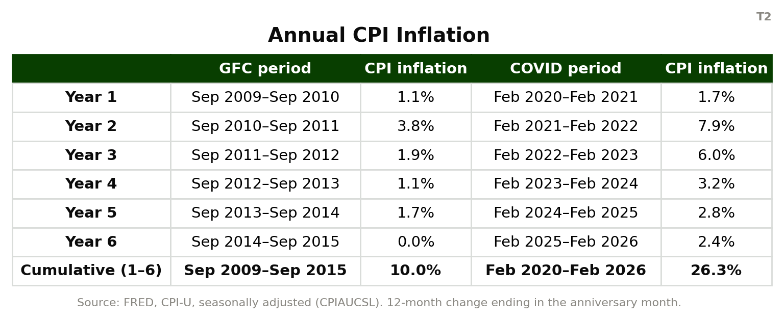
This is where structural differences in the two crises, and in the magnitude of the fiscal responses, play an important role. While cumulative M2 growth looked nearly identical, inflation was 2.5 times greater post-pandemic. Milton Friedman popularized the quantity theory of money: MV = PY. The quantity of money (M) multiplied by the average number of times it is spent (V) must equal the purchase price (P) of all the real output (Y) bought and sold in the economy.
Money supply is only one of the variables. Prices adjust to balance the equation when M or V or Y change. Although a reduction or slowing of real output can put upward pressure on prices, all else equal, such effects tend to be “transitory” based on some shock to the economy. Reduced output can only push prices upward for a sustained period if the output (the economy) contracts for an extended period.
Velocity (V) has long been a wild card in the equation — something we can’t observe directly or forecast easily. But we do know it is related to the regulatory regime around lending and the liquidity (cash) people have access to. Both of those factors fueled higher velocity (and thereby higher prices) post-pandemic compared to post-GFC.
What Happened After?
For almost a decade after the GFC, tighter financial regulation under Dodd-Frank constrained credit creation and made lending more restrictive. The Federal Reserve also began paying interest on reserves banks held at the Fed, making it profitable not to lend. That slowed the growth of M2 and suppressed economic activity — even as the Fed’s balance sheet grew. Post-COVID, no comparable regulatory brake existed, and much larger fiscal stimulus flowed directly into bank deposits and household spending, rather than sitting inert on bank or Fed balance sheets.
The shocks to demand and supply were also different between the two cases. The GFC was preceded and accompanied by declines in global demand without a significant decline in supply (and of course in housing, there was an overabundance of supply). In contrast, trillions of dollars of COVID-era stimulus boosted spending, despite supply disruption and backlogs.
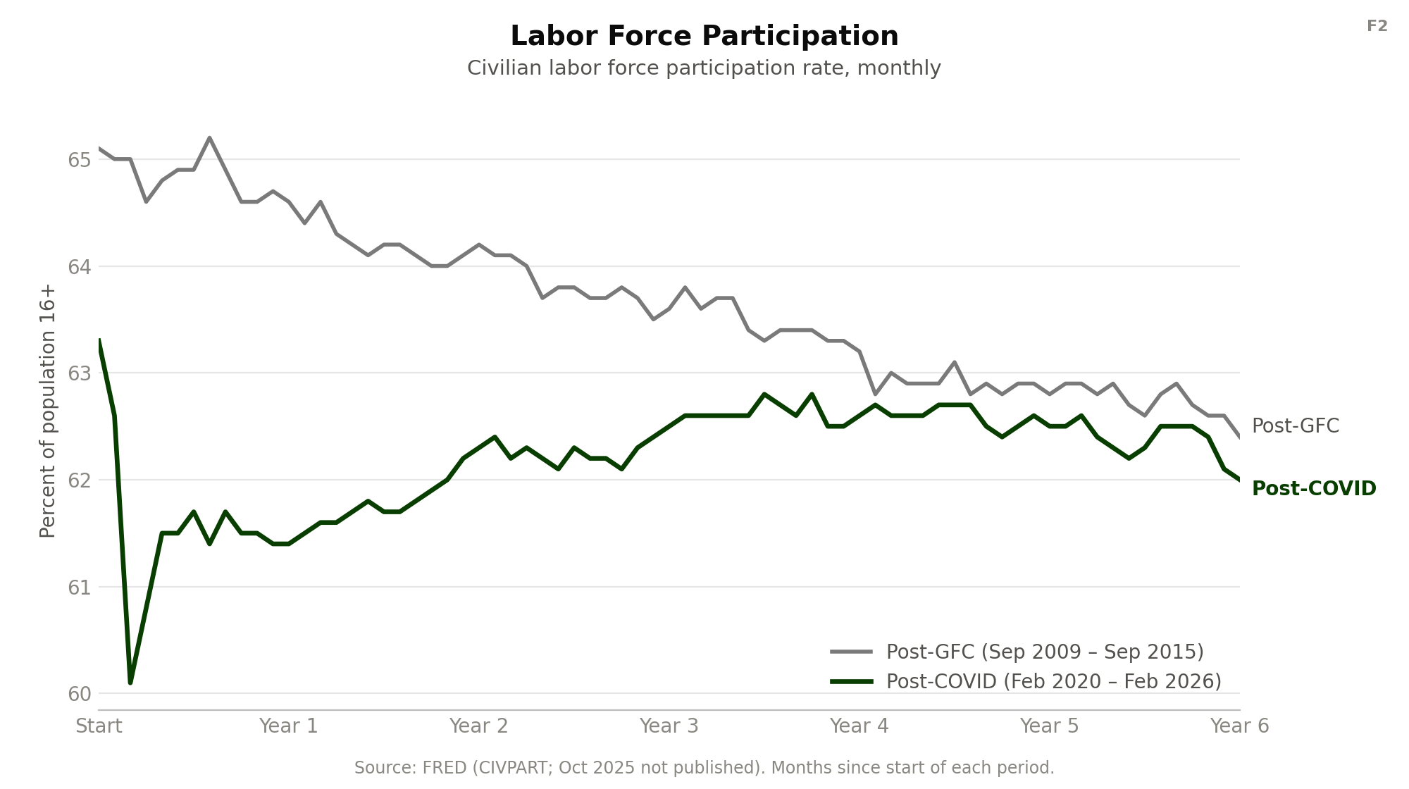
Employment trends post-GFC and post-COVID were also structurally different. The GFC followed significant economic disruptions and malinvestment. The pandemic created an almost instantaneous, dramatic, extrinsic shock to the system, rather than stemming from existing problems in the economy. This caused a quick, sharp decline in labor force participation initially, and then partial recovery.
Following the GFC, the labor force participation rate fell steadily by about 2.5 percent (compared with about 1 percent post-COVID), and there was much higher unemployment. As University of Chicago economist Casey Mulligan testified before Congress, the design and eligibility rules of expanded social welfare programs created persistent disincentives to re-enter the labor force. This contributed to mismatches between aggregate demand and aggregate supply.
What Can We Learn?
Ultimately, these are two different monetary and fiscal stories. Many government actions looked similar across the two episodes, but crucial differences — including regulatory credit rationing and conditions attached to government subsidies — determined whether the money actually reached the real economy.
Given the difference between the two episodes, we should be wary of letting M2 grow rapidly, as well as of creating benefit programs that discourage working. Fiscal stimulus, accompanied by monetary easing, leads to inflation. Mounting federal deficits and debt, even in the absence of a crisis, should concern everyone who wants their money to maintain its purchasing power.
The most recent data show inflation (CPI) running 3.8–4.2 percent through April and May of 2026, with M2 growing 5.5 percent year-over-year as of June 2026. Both suggest more should be done to pull inflation back in line with the Fed’s 2 percent target. With annual federal deficits in excess of $2 trillion, there will be enormous pressure on the Fed to accommodate borrowing with new credit.
Even though inflation was muted post-GFC, regulatory credit rationing is not always a good idea. That period was also characterized by abnormally low economic and job growth for a recovery period. And while the economic recovery post-pandemic was relatively strong, it came with a big dose of inflation. Policymakers are unlikely to get the “optimal” outcome by tinkering with the economy, and may contribute to other ills: slow growth, lower labor force participation, or inflation. Restraint in monetary and fiscal policy is the best road to stability and recovery.